This project entails the branding and UX design of a UN agricultural web application, commissioned by Draxis SA. Initially, we conducted a thorough research on names and naming variations, inspired by Greek mythology deities, and presented them to the client. The selected name is Carpo, daughter of Zeus and one of the Horae (the goddesses of the seasons and the natural portions of time).
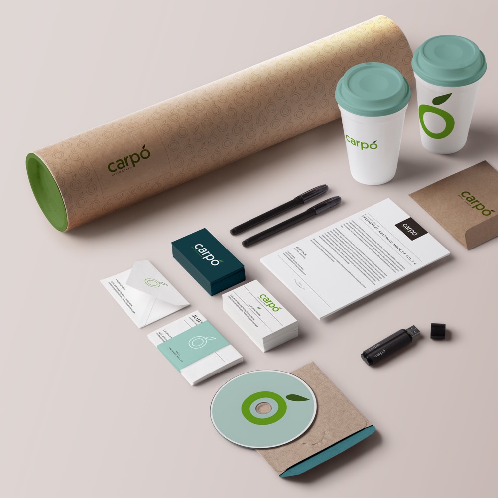
The logotype itself is quite minimalistic; the wordmark consists of the brand name adorned with a small leaf as a reference to nature and a pronunciation hint, as well. The focus is on versatility, legibility, and clear typography. The logomark is the letter “O” with a small leaf, symbolising a fruit (“carpos” in Greek).
Apart from the logotype, we also designed the wireflow and basic architecture of the application, as well as high fidelity mockups for the application dashboard.


