
Mozilla Activate website UI/UX
Redesign and UI/UX design for the Mozilla Activate website, a hub that galvanizes the community into supporting Mozilla and its endeavors. After consulting with the client, we established that the goal of the redesign was three-fold. First, when there is a campaign in place, we should showcase that particular campaign.
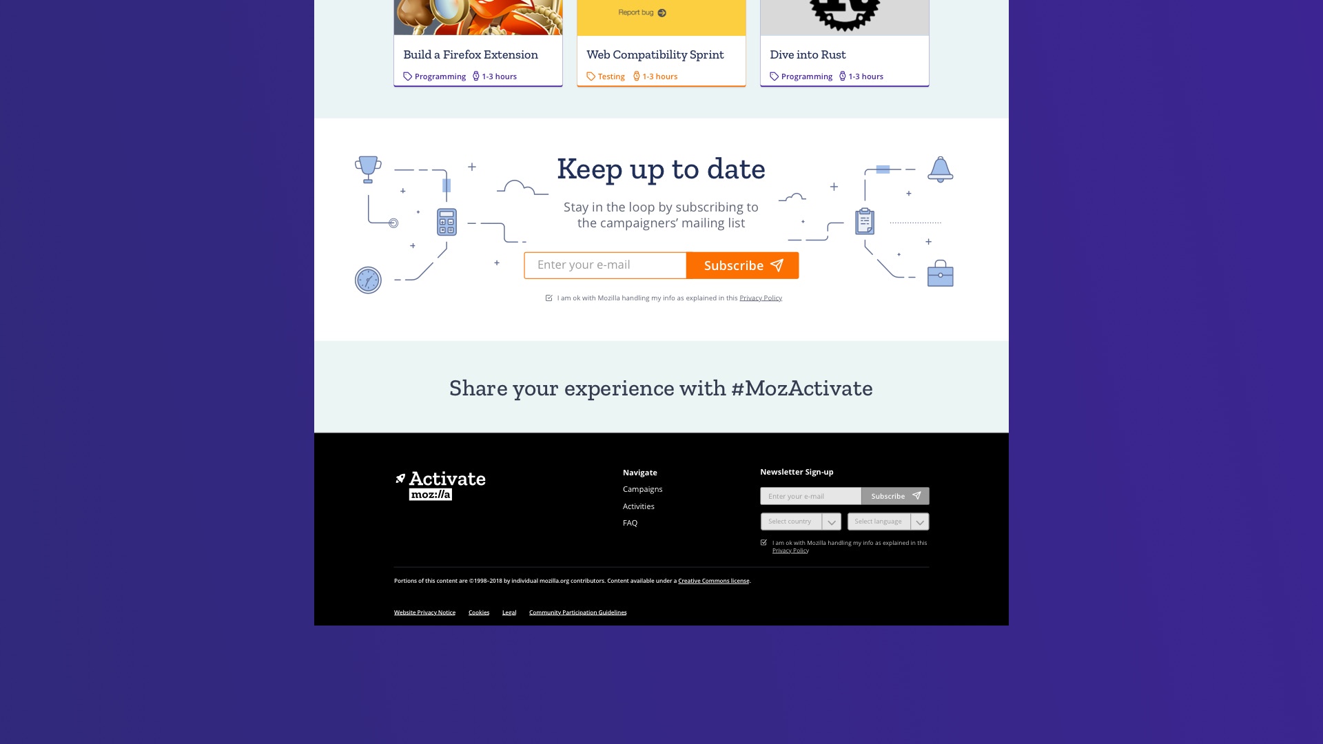
When there’s no active campaign, we should highlight the “evergreen” activities. Last but not least, we considered that the newsletter is a really valuable tool for those community members that want to help, but missed a previous campaign.


mock-ups
Using the launch as a visual metaphor we created a very straightforward presentation that placed the campaign front and center and emphasized it with simple engaging copy. What follows is a list of the activities in a compact and easy to skim through list. Last but not least, we tried to make signing-up for the newsletter as appealing and easy as possible. So we designed an expanding form, that doesn’t discourage the user, and at the same time it doesn’t feel deceiving.
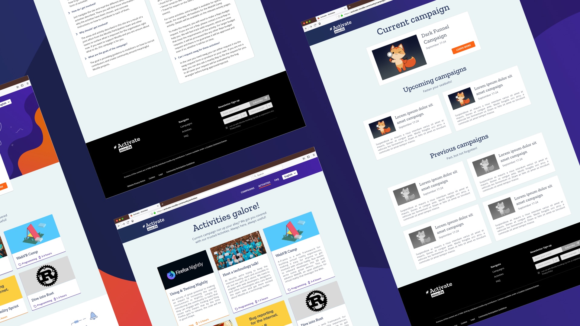
On the Information Architecture front, we reworked the FAQ to make it easier to read and find what you need. And on a specific activity we transformed the previous wall of text, into a page that reads like a recipe. The “List of ingredients” contains the technical aspects of the activity, while the process is broken down into easy to absorb chunks.
